How Developers can Accelerate Global Accessibility
)

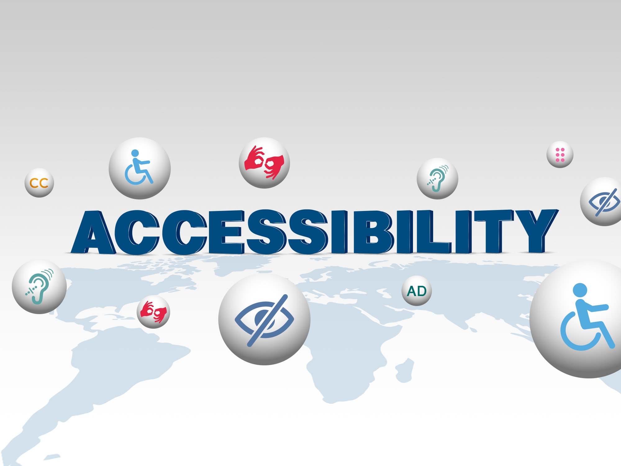
Developers have the opportunity to optimize web apps for better visual, hearing, and mobility access – and many best practices cross over from area to area to help easily reach even more individuals who can benefit from adapted design practices.
What is Accessibility?
Every user deserves a five-star digital experience online. People with disabilities must be able to experience web content and web-based services with the same successful outcome as those without disabilities. This awareness and commitment to equity and inclusion is the goal of Global Accessibility Awareness Day (GAAD), a global event that shines a light on digital access and inclusion for people with disabilities.
Accessibility can be understood as the ability to access and benefit from a system or entity. This concept focuses on enabling access for people with disabilities, but research and development in accessibility can benefit everyone. This is known as the the curb-cut effect: Designs created to benefit people with disabilities often end up benefiting a much larger user group. A few examples include:
Curb cuts in sidewalks were originally designed for wheelchairs – but they also help people with strollers, bikes, scooters, and more.
Closed captioning on video material was originally for people with hearing impairments – but they also help people watching videos in noisy or silent environments, or foreign/international viewers.
The typewriter was originally invented to help the blind write, but became the standard method of written communication for all.
Why Accessibility Matters
Developers are uniquely positioned to play a large role in increasing and expediting accessibility globally in the designs of websites and apps – according to AccesiBe, around 2.3% of the US population needs some sort of assistance to access the Web. Not included in that number might be those who have not reported their impairments in surveys, or fall along a spectrum which might still benefit from mindful, adaptive design elements.
Some of the causes of the most common accessibility failures are low contrast text, missing image alt text, empty links, missing form input labels, empty buttons, and missing document language. Many of these fixed also elevate the development quality of a website, and are easily corrected to help support a better user experience for all web users.
Visual Access
Optimizing web content for varying visual abilities might take a combined approach – those with color vision deficiency might benefit from design which utilizes accessible color schemes, and relies less on differentiating between monochromatic shades.
Providing a better experience for those with low vision or those with other visual impairments means incorporating shapes, color and text together to emphasize meaning and direction, as well as keeping content in a straightforward, simple visual layout, with one alignment justification. Just like for color vision differences, using high contrast, readable text formats can greatly improve visual access for all body text and section headlines.
Improving the visual layout of text, while working to keep phrasings and overall experience short and concise, not only benefits visual needs but other accessibility areas as well.
Improving Access for Mobility, Hearing impairments, and Screen Reader users
When we think of “accessible” when referring to web content, we often follow it with the word “design”, which is often inherently interpreted as visual for sighted individuals. The reality is that many adaptive or assistive technologies rely on clear layouts and organization of the page elements for screen readers, closed captioning tools, and keyboard and touchscreen use.
Pages with extra wide formats can be cumbersome to navigate, especially when right margins are not fixed. This means that while text to speech technology might read text without issue, someone who wishes to read along or look at graphical elements will have to scroll both horizontally and vertically, likely experiencing lag. For those using mobility aids, this creates extra steps to navigate a page and can be a barrier to a good digital experience.
Clean use of HTML5 elements makes it easier for web applications to adapt to outside tools. Subheadings created only with visuals such as text size and physical screen placement in mind might not come across clearly with screen reading technology, where they can otherwise be adapted for their intended use. Smart use of these section dividers give meaning, emphasis and direction to page content which can also speak to neural/cognitive differences, helping to reinforce understanding of main points.
Lastly, transcription is growing in ease of integration and awareness on many platforms, such as TikTok, YouTube and through content creators themselves making an effort to create inclusive content for their entire following. Developers do well to hop on this wagon of including captions within videos, and providing image descriptions which can be read with text-to speech tools.
Learn More
Developers have the opportunity to optimize web apps for better visual, hearing, and mobility access – and many best practices cross over from area to area to help easily reach even more individuals who can benefit from adapted design practices.
To get started on our developer portal, register for a free account to get your free API key.
Have some thoughts on what design practices you’d like to see in the world of mapping? Tag us on Twitter, or ask us a question in our Forum.