Button
Important note:The TomTom Digital Cockpit SDK is not available for general use. Please contact us for more information.
Button is a graphical control element that gives users a simple way to trigger an event, like search queries on a search engine or interacting with dialog boxes (for example, confirming an action).
The control appears as a recognizable, clickable element, similar to a physical button. It is typically placed throughout our UI, in places like panels or overlays.
Anatomy
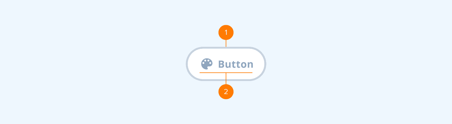
- Container: The background of the Button. It includes a background color, stroke width and style, radius, and elevation properties.
- Content: Icon and/or label.
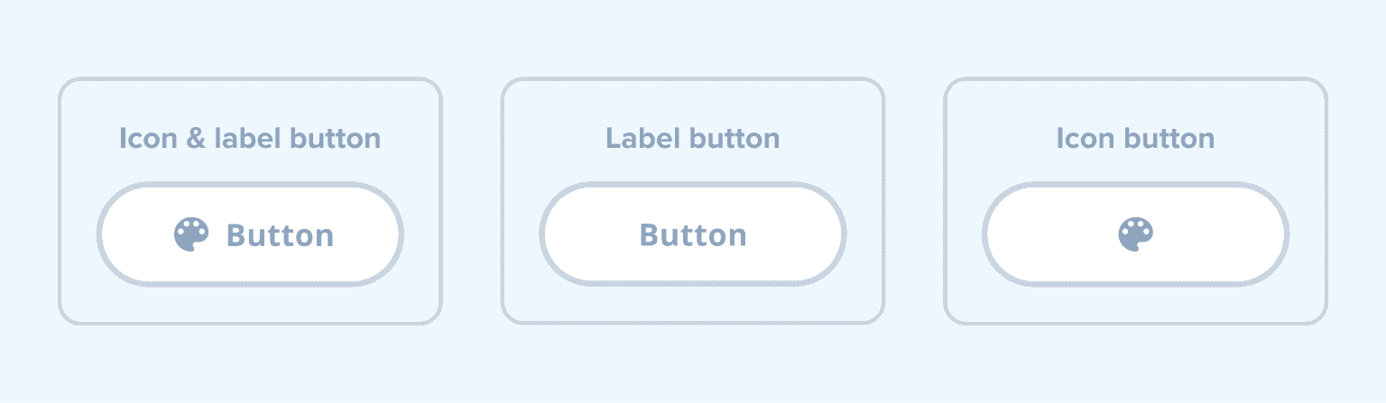
The Button supports the following configurations:
Types
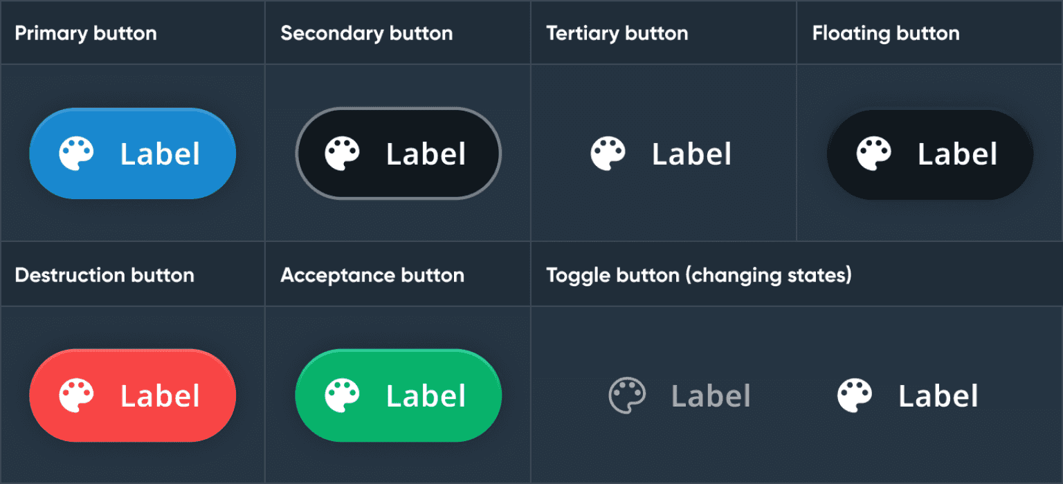
| Button types | About |
|---|---|
| Primary button | Used for actions with the most emphasis when a clear "call to action" is needed on a screen, or when from a range of commands one is predominantly used. |
| Secondary button | Used for actions with less emphasis. These are the most commonly used buttons as they are visually clickable but do not distract from the content. |
| Tertiary button | Used for actions with the least emphasis. |
| Floating button | Used for actions that can hover over the content. |
| Destruction button | Used for actions with a negative emphasis that results in data loss. |
| Acceptance button | Used for actions with a positive emphasis that results in success. |
| Toggle button | Used for actions that allow users to switch between two or more states or options. |
States
The Button supports multiple states to indicate its status:
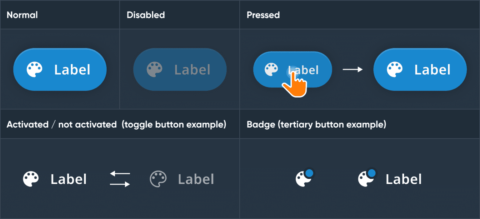
| Button states | Use |
|---|---|
| Normal | The default state of the Button. |
| Disabled | A state when the Button is not active for connection or input reasons. |
| Pressed | A state when a user taps on the Button. The Button animates (dims and shrinks) to provide feedback. |
| Activated | A state when an action is activated. Most commonly used in the toggle Button to switch between normal and activate/selected states. |
| Badge | A state that indicates a status, notification or event. The Button shows a small UI item called a badge on top of the icon. |
Usage
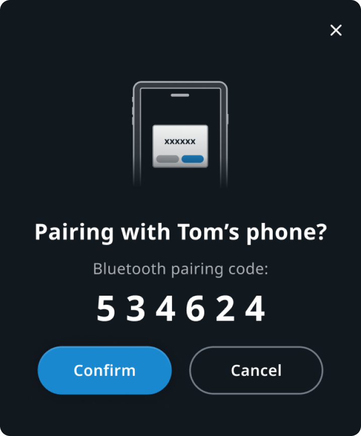
Bluetooth pairing flow modal
Primary button "Confirm", secondary button "Cancel", tertiary button "x" to close modal.
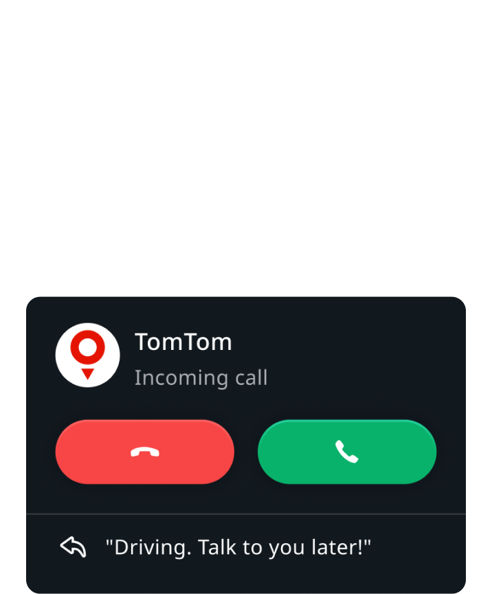
Incoming call notification
Destructive button "Decline call", acceptance button "Accept call".
Customization
| Type | Customizable |
|---|---|
| Theming | The sizing of the container, text, margins, paddings, and icons can be adjusted. Additionally, it is possible to change the styling of the container (background and elevation), text and icon. |
| Configurations | Different combinations of label and icon are supported. |
| Content | The labels can be changed and icons can be replaced (unless they are non-customizable map assets or coming from a third-party service). |