Tab Bar
Important note:The TomTom Digital Cockpit SDK is not available for general use. Please contact us for more information.
Tab Bar is a navigation control that organizes and allows navigation between groups of content that are related and at the same level of hierarchy.
The control is primarily used inside apps or panel headers.
Anatomy

- Tab item content: Icon and/or label.
- Selector line: The line that highlights the selected Tab Bar item.
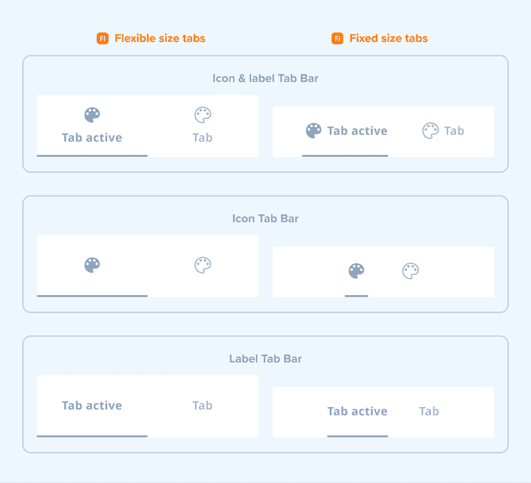
The Tab Bar items come in two sizes (flexible and fixed) and support the following configurations:

| Tab types | About |
|---|---|
| Flexible tab size | All the tabs are equal in width, which is determined by dividing the available space by the number of tabs. |
| Fixed tab size | The size of tabs depends on the content. |
States
The tab item supports multiple states to indicate its status:

Usage

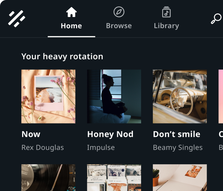
Source tabs in Entertainment
"Home", "Browse", and "Library" example tabs in a media source.

Tabs in Communication
"Favorites", "Recents", "Contacts", and "Dialpad" tabs
Customization
| Type | Customizable |
|---|---|
| Theming | The sizing of the tab item, selected tab indicator (height), text, icon, margins, and paddings can be adjusted. Additionally, it is possible to change the styling of the container, selected tab indicator, text, and icons. |
| Configurations | Two types of tab items (flexible and fixed in size) are supported. Also, different combinations of label and icon can be shown. |
| Content | The labels can be changed and icons can be replaced (unless they are non-customizable map assets or coming from a third-party service). |